UK trackers are now closed, and we can confirm we’ve collected over 39,000 responses from around 90 UK institutions. That’s almost double last year’s response rate and number of institutions engaged.
After all the hard work of engaging students, we know that data analysis can seem daunting. That’s why this year we want to make it really easy to analyse and present your data.
Analysis
We’ve provided a handy summary of your analysis options via this blog post, which links to detailed guides. Don’t forget that you will be able to benchmark your data with the rest of your sector very shortly. So you can download clear, visual reports of your responses – and the associated benchmarking results – directly from the Tracker platform.
Presentation
This is still quite a lot of information to deal with. So this year, thanks to some brilliant creative work by Tabetha, we are pleased to offer you a PowerPoint template and associated Excel template for organising and presenting your key findings. Here are the links you need to get started.
- pdf version to view
- powerpoint template to download, save and use
- associated excel spreadsheet to download, save and use
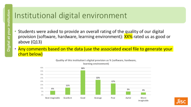
Based on last year’s feedback, we have selected those questions we think will have the greatest relevance and impact at organisational level. The excel file identifies the relevant question numbers, allowing you to drop in your data and quickly generate charts and tables. The charts and tables can then be exported straight into the powerpoint slides, which include explanatory text and colour coding for the different sections of the Tracker.
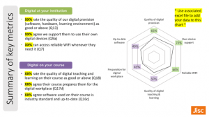
The summary slide presents six key metrics about the institutional and course-based digital experience. This is followed by more detailed slides, one from each of the four sections.
 So now you can present your key findings with a minimum of effort. Of course you can always cut out slides and bullet points you don’t want to use – and you can add in more detail in the same style. But we think these two documents give you a clear, credible and coherent story, and I’m sure you’ll agree that Tabetha has done an awesome job.
Coming up
Next week will see the arrival of benchmarking data in your trackers – look out for emails from Tabetha and Mike to let you know it is ready.
We will also be launching new guidance for analysing data from the teaching staff tracker, alongside the student tracker, if you are piloting both.
Also in the coming weeks we hope to share with you:
- A poster template you can customise and use to share your findings with students and staff
- A new digital student benchmarking tool – now mapped to the Tracker questions – so Student Unions and Guilds can drive the agenda for improvement
- In discussion, a ‘digital toolkit’ template, allowing you to draw on your tracker data to create a toolkit for incoming students.
- On Thursday 28 June at 12.30 there will be a webinar for tracker pilots to share with you the overall data findings for UK HE and FE and the advice of our expert panels.
More details of these shortly by email and blog. Meanwhile, please let us know what you think of the new resources. And remember, we are here to make your data do the work, so you don’t have to 🙂
One reply on “Time to analyse and present your tracker data”
This looks amazing – thank you!